In September 2022, Adobe announced that it was buying Figma, the publisher of a web application that competes with Adobe XD... before backtracking. Today, Figma is the leading tool for designing digital interfaces. From the design of a simple wireframe to test an idea to the creation of an interactive prototype that looks exactly like the final version of a product, its place in the hearts of designers has only grown. So how and why has Figma carved out such a place for itself in the competitive market for design tools? Florent Bachelier, UX designer, explains.
Figma is a professional tool initially designed for interface designers (UX designer). It comes in different versions, depending on your needs: a free version and three paying versions: a 'Professional' version, an 'Organisation' version and a customised 'Enterprise' version.
You can access Figma free of charge and explore the vast majority of its features. If you want to use it professionally, you'll need to upgrade to a paid version. The introductory price for Figma Professional is 12 euros per month for a publisher.
That said, a number of features attract design professionals to Figma, such as the ease of real-time collaboration, the ability to create advanced interactive prototypes and integration with other popular tools.
Collaboration, the key to a user-centred approach
The application is cloud-based, making it easy to access all your working documents, wherever you are. Figma is accessible via web browsers on all major operating systems. Figma's great strength lies first and foremost in its effective collaboration.
Working together in real time
Being able to collaborate and communicate in real time helps project stakeholders to be more efficient. Figma has always been committed to fostering this collaboration. The tool should not be a hindrance, quite the contrary.
"With Figma, it's easy for teams to work together, no matter where they are."
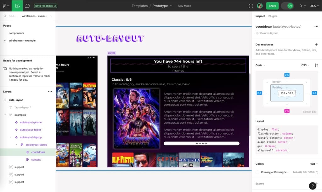
The tool takes this collaboration even further. One example is the recent integration of a dedicated interface for developers.
The fashion dev
This module has been integrated into the interface since June 2023 (Beta) and will be available in a paying version.
Figma also includes a collaborative whiteboard (Figjam) that can be used to run workshops or meetings, or to gather information about users.
"We share everything in a single tool.
This effective collaboration also results from the possibility of easily sharing work, making comments and modifications live, and using a common language (CSS). Or the fact that many people can work on the same file without bugs or limitations on participation.
Integrating other collaborative tools into Figma
Figma can be integrated with other design, project management and development tools, such as Sketch, Adobe XD, Jira, Slack, Photoshop or Illustrator. There is very good communication between the Adobe suite and Figma. For example, you can copy and paste Adobe XD files into Figma.
A number of plug-ins can be used to enhance these designs or to use resources made available by other designers.
Finally, it is possible to export all of this work. The tool's vector format makes it interoperable.
A user-centred approach
Figma's other strong point is its user-centred approach, which is very important for designers. The Figma team seeks the opinion of its community, listens and tests features. This gives it a high degree of velocity and allows it to improve the experience of designers with each update.
Complexity hidden in simplicity
The interface structure is easy to understand. At first glance, using Figma is fairly straightforward.
Figma's key features
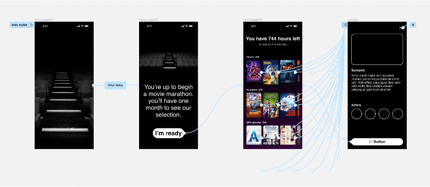
Figma lets you create mock-ups, collaborate in real time and make comments and annotations. You can also use libraries of ready-made components or create a design system from scratch. Users can also create interactive prototypes, enhancing immersion and user testing.
The essential functions
- Layers
- Shape tools
- Add images to design files
- Masks
- Sections
- Creating page layout grids
- Auto Layout
- Creating dynamic designs
- Style elements
- Typography
- Browse and apply fonts
- Adding links to text
- Components
- Component properties
- Variables
- Libraries
- Creating and inserting component instances
- Creating prototypes
- Scrolling the prototype and scrolling options
- Creating advanced animations
- Variable modes in prototypes
- Multiple actions and conditional logic
- Using expressions in prototypes
- Using variables in prototypes
- Fashion dev
- Import files into Figma
- Export from Figma
- Share your work
Advanced functionalities
Figma focuses on parameters the most commonly used design parameters. But it is always possible to go further in the granularity of the parameters. This is the case, for example, with motion design interactions or typographic details (the baseline).
Example: a new advanced prototyping function
Variables can be used to create complex prototypes.
Meiso: advanced prototyping capability
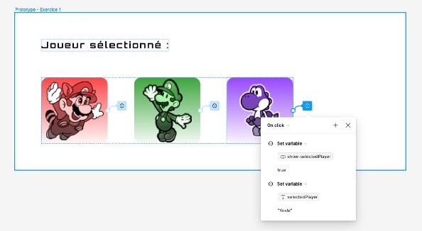
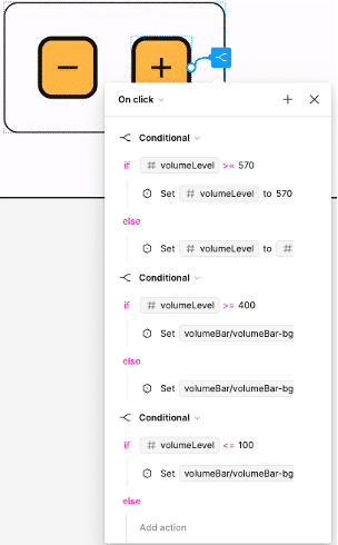
Example: use of Figma for user testing (new functionality).
As a result, there are no major difficulties in using Figma because its level of complexity depends on user needs. There's no need to use complex functionalities as a first step to create a low-fidelity mock-up and test a concept.
A tailored offering that listens to its users
Figma is very close to its users. Small changes are regularly made to the software throughout the year. Another advantage is that users are supported during these annual updates, which are also very quick.
"The Figma editors have adopted a continuous improvement approach.
For example, the latest update allows users to move their mouse over typefaces in the Typeface Explorer to see how they look directly on their work. This was something that had been reported as missing.
In this way, Figma users are involved and contribute to the continuous improvement process. The publishers listen to their users and regularly ask them for feedback. The result is an optimal user experience.
On Figma, users form an active community.
On the security side, there are settings for creating passwords, even with the professional version.
Florent Bachelier's user experience
How I use Figma
L'user experience design (UX) predominates in my job, to the detriment of theuser interface design (UI). The basis is more information architecture. So I start by using features that allow me to produce low-fidelity mock-ups (greyscale colours, typography hierarchy, basic interactions) before going further in the design process (more advanced UI, prototypes).
My tips for optimizing interactive design
I use three types of pages in a Figma file (free):
- Models Page;
- Components Page;
- Icon libraries page.
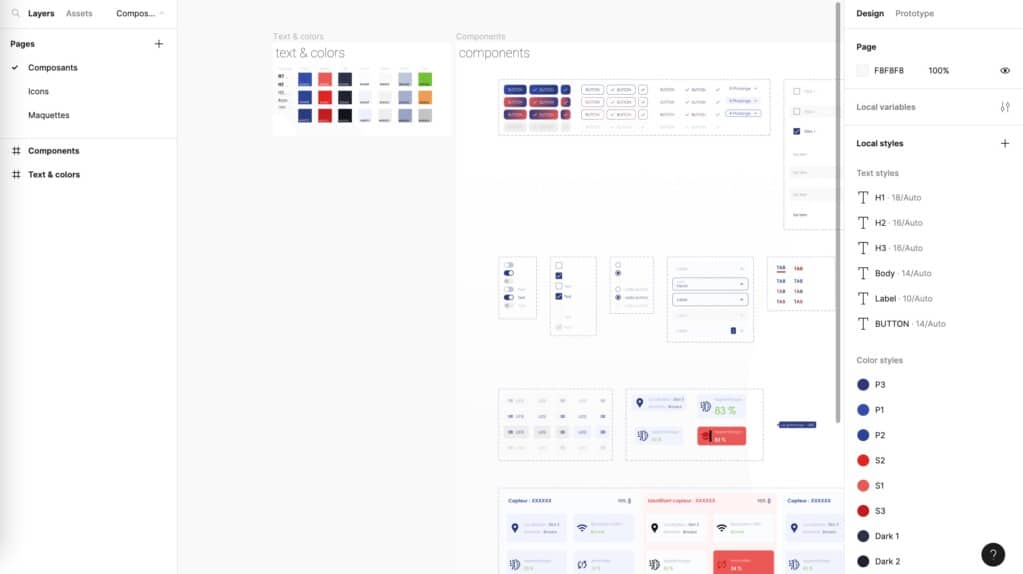
It is important to distinguish between master components and used components (e.g. instances). I create a batch of components or I use a batch that has already been created. The aim is to factor the components as much as possible to avoid lengthy modification work. The idea is also to use the developers' work logic to reduce barriers and encourage collaboration.
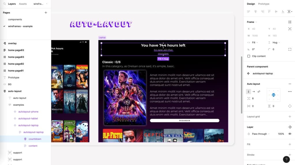
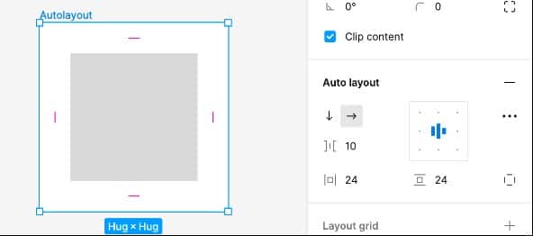
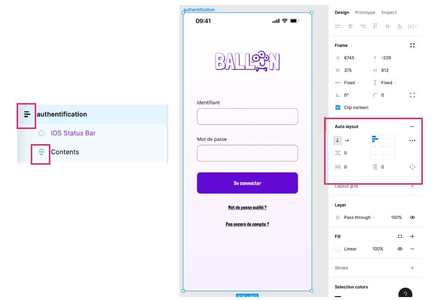
I only produce my designs in auto-layout. This page layout feature allows elements to be repositioned and resized automatically. The work is more rigorous, but the design is more harmonious and above all easier to transpose into production.

My advice for new users to fully leverage Figma in their design work
- Give priority to simple functions when you start modelling.
- Sometimes the best is the enemy of the good: be open to different methods to stimulate creativity.
- Be rigorous in terms of spacing (margins). Use existing guidelines. For example: use a multiple of 4 for spacing and therefore always have 8 pixels between an image and text.
- Use auto-layout whenever possible when mock-ups are used as specifications for developers.
Figma is an essential tool for designing digital interfaces, thanks to its wide range of functions, the principle of real-time collaboration and its user-centred approach, which involves an active community in the continuous improvement process. Figma offers a flexible, collaborative platform that is constantly evolving to meet the needs of designers and digital interface design professionals.


